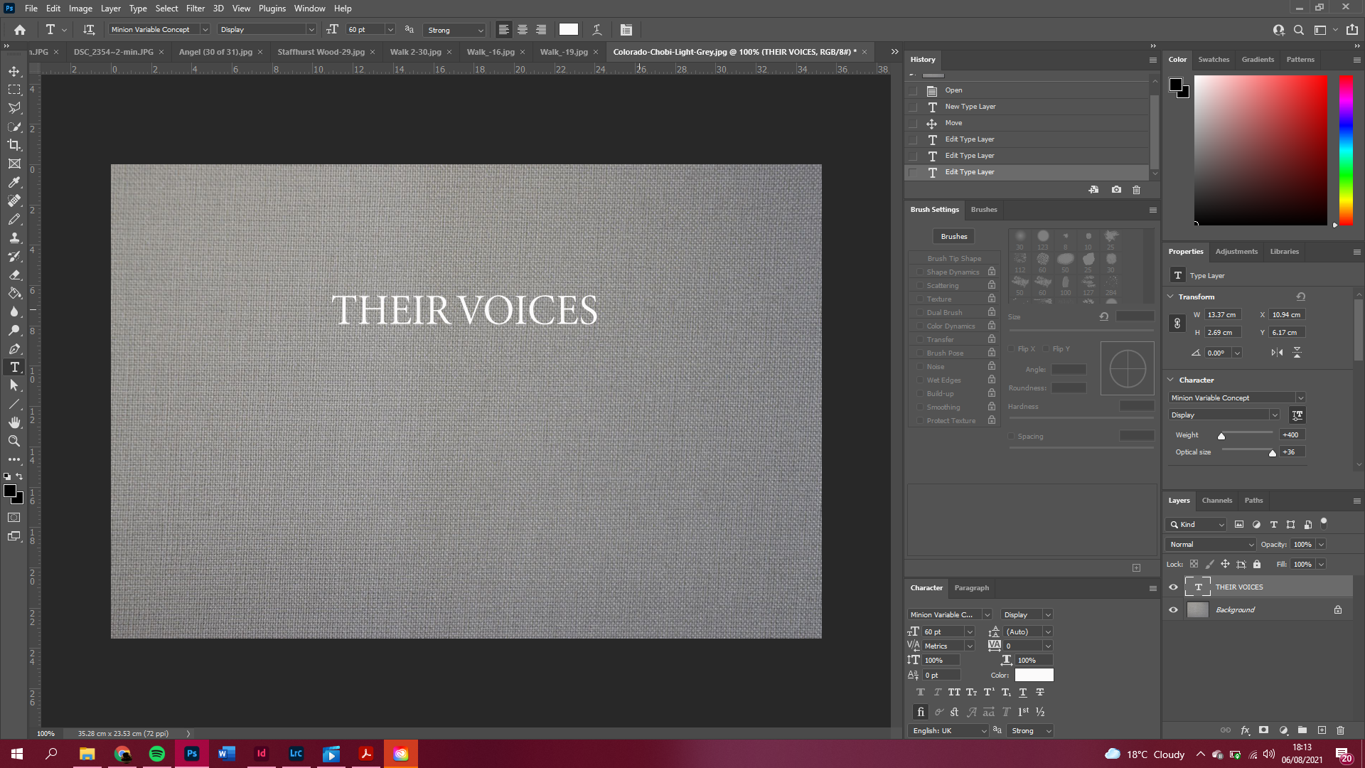
Now that I know what I would like the title to be, I wanted to play around with different fonts and sizes to see where it would fit best on the front cover. I decided to go for a grey material over the book to make it feel more mysterious, the only thing the viewer sees when is the grey cover with the title, which doesn’t give too much away, but enough to make it seem interesting.
I just got a simple grey material cover off of google images to create this effect, so obviously when I make the actual cover it will need to be the same size as the book, as shown below.
I am definitely most happy with this font, title and placement for the cover, I think it looks sophisticated and simple.
These are the finished covers for the book. Including a spine of 0.21 mm, which is enough for the 44 pages in the book.


