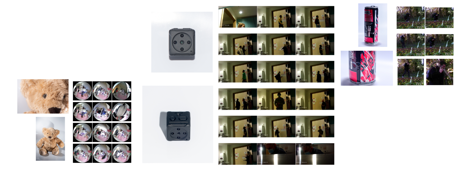
I put together a few ideas of what I could have for my Crit display, but I was lacking inspiration and motivation, I wanted for it to look quite messy and confusing as that it sort of what it feel like when you feel as if your being watched, however I just did not feel that the images worked that well together, the shadows from the white background images were very disturbing and off putting and they were not very great pictures in general.
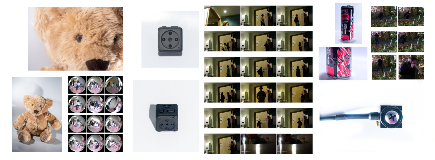
This is why I decided to re-shoot some of the camera images as I felt they could look a lot better!
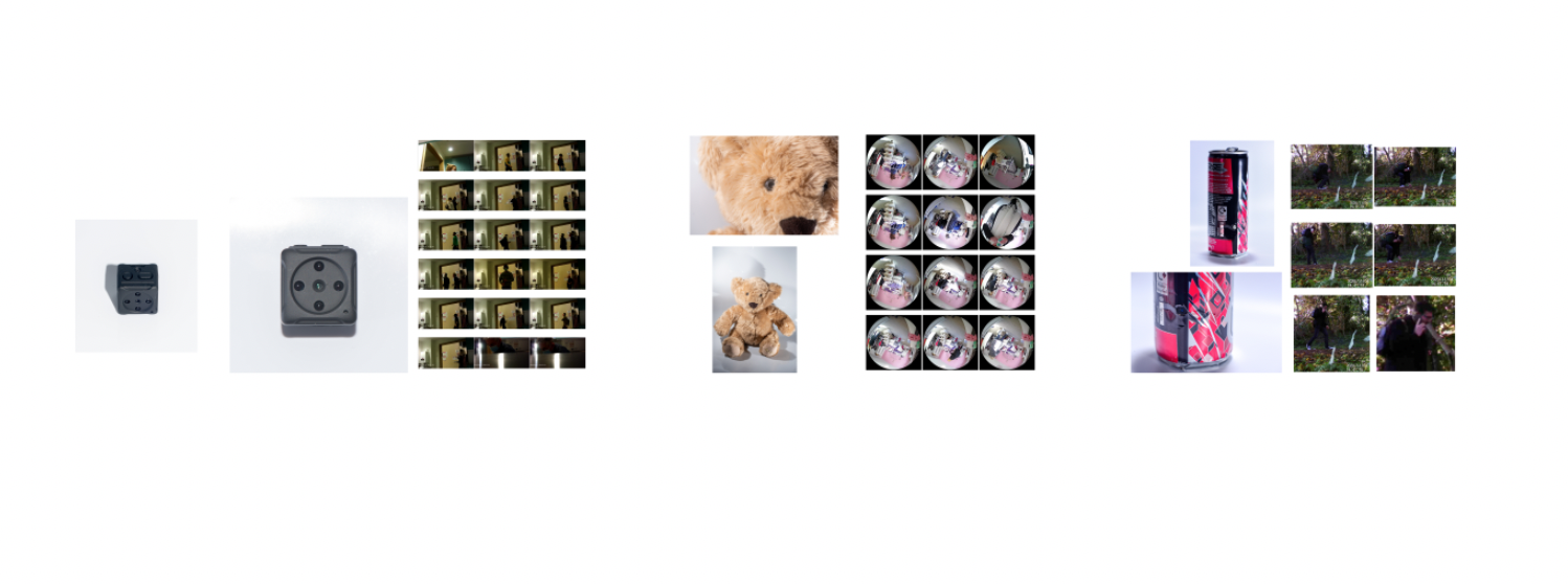
Eventually I decided on the layout below, as I felt it had the most potential out of the lot of them, it was busy, and I decided to print the images quite large to make them feel more meaningful. I printed it on PF Lustre 175 to give it a nicer finish, but unfortunately, my largest image came out very dark and gloomy which I was very upset about, but that is mostly because I rushed it and I should have exposed the image a bit more. I am not too happy with the overall display, I feel as if it does not show the true potential of this project and it is a bit boring if anything for a project that is meant to be fun. As well as the images being bad quality and not great.
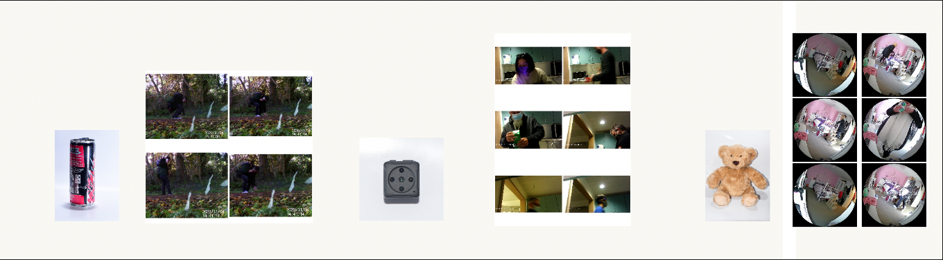
Although it was definitely an experiment, I haven’t printed images of all different sizes for a layout before so it was definitely something to try out and learn from.
