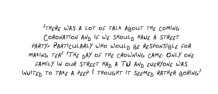
After a long time trying to figure out what I should do in terms of a font for the photobook, I found out there is a way of creating your own! Initially, I was going to use Jake’s nan original book; however, I was slightly worried that in parts, it is quite challenging to read. So I decided to settle with ‘American Typewriter’ in InDesign to rewrite out the extracts from her book as it looked like the most visual font in terms of handwriting. However, today through procrastinating on my favourite social media platform, TikTok, I viewed a video in which someone had created their own font by printing out a template and writing in every letter and symbol to upload it into this online page then! So I decided this might just work if I get Jake’s nan to complete the template, so I did. I was not too pleased with the outcome at first; however, after tweaking it a bit in InDesign, I feel it works well and adds that extra touch of personality to the photobook!
Jake’s nans handwritting
I felt it helped to see how she is unable to write in a straight line even on lined paper due to her tremors. It amused me as it almost looks as a child has written it, but she always mentions how ‘they saw you return to your childhood in old age’.
I played around with it quite a bit making sure the spacing was correct, the lines were not too close together, I decided it looked better in smaller capital letters. I added in a bit of depth to the writing making it a bit thicker. Overall, I am quite pleased with the final outcome!


